Dashboard Guidelines preview

The problem

Auth0 had just finished evolving its brand, but the new identity stopped at the marketing edge. Inside the product, the dashboard still felt cold and utilitarian. Every surface was business-first, and none of them carried the warmth the brand had spent months defining.

The cost wasn’t only inconsistency. Every feature that shipped in the old voice was one more thing to retrofit later, so the gap widened with each release.

What I did

I joined a cross-functional Brand in Product team and took the dashboard layer: the moments users hit every day, where brand either earns its keep or gets in the way. I treated it less as a coat of paint and more as a set of decisions about how the product should behave in its small, human moments.

I audited the dashboard for the touchpoints that carry the most emotion and get the least attention, then designed a pattern for each.

The work concentrated on the high-touch surfaces:

  • Empty states that orient and encourage, instead of leaving a blank panel and a shrug.
  • Alerts, banners, and notifications in a consistent voice, so a warning still feels like the same product as a success.
  • Feature onboarding moments that introduce something new without blocking the task at hand.
  • Illustration and iconography that keep the tone reading the same from one surface to the next.
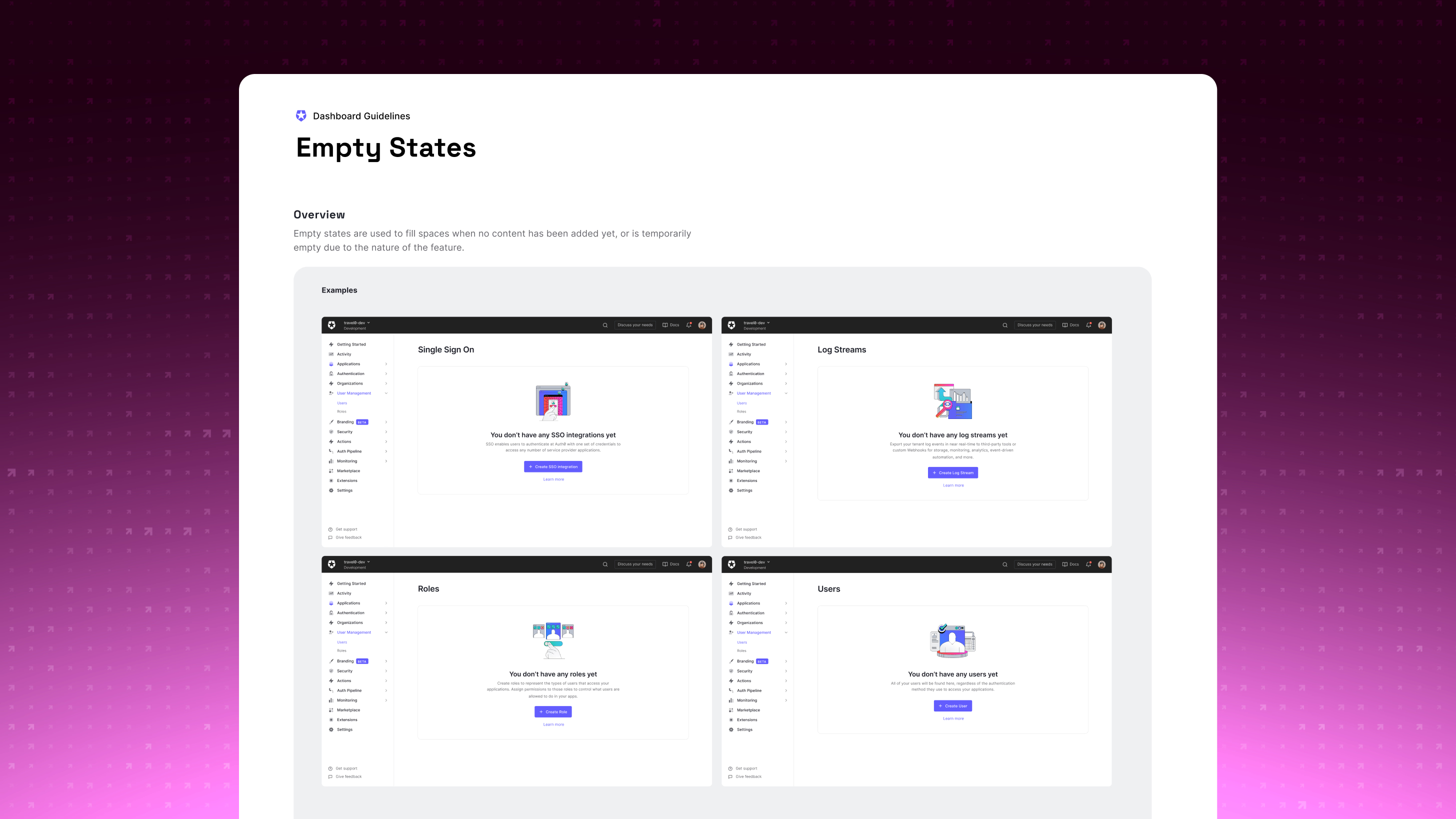
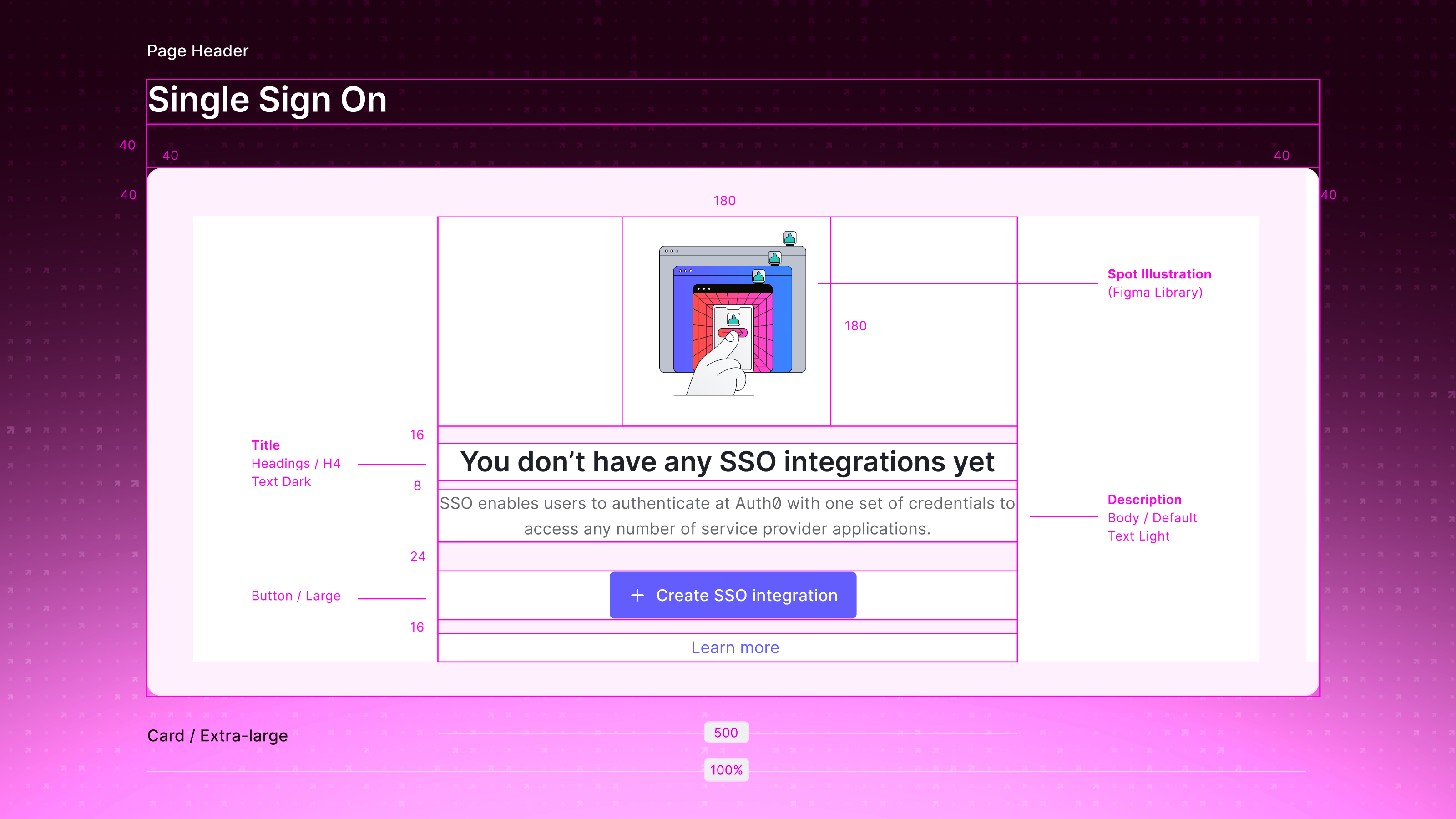
Empty-state examples across the Auth0 dashboard — Single Sign On, Log Streams, Roles, and Users — each pairing a spot illustration with an explanatory line and a primary call-to-action button.
Empty-state patterns that orient and encourage rather than leaving a blank panel.
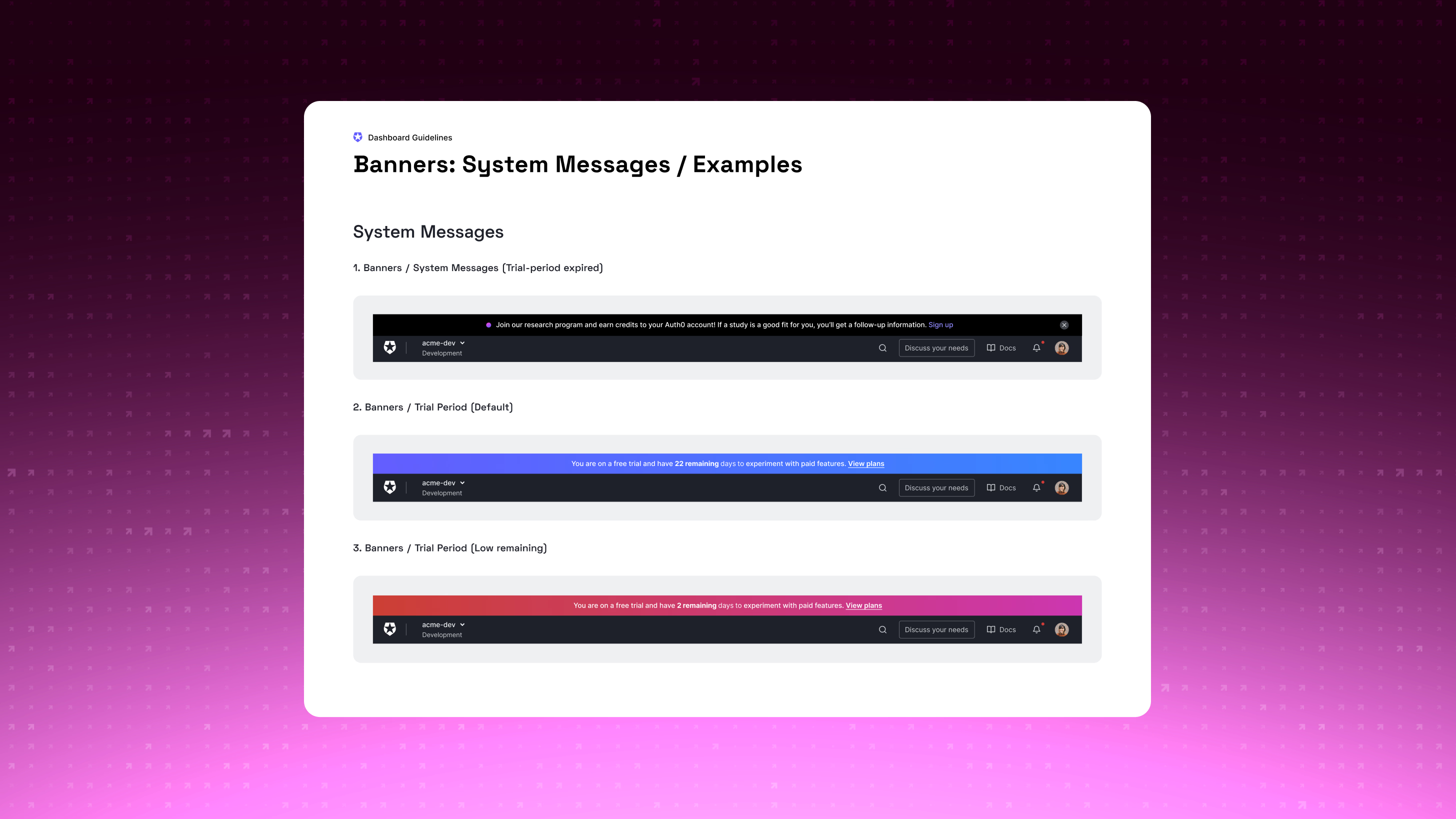
System-message banner examples stacked above the dashboard top bar: a dark research-program invitation, a blue default trial banner with days remaining, and a red-to-magenta low-remaining trial banner.
System-message banners in a consistent voice, from a neutral notice to an urgent trial warning.
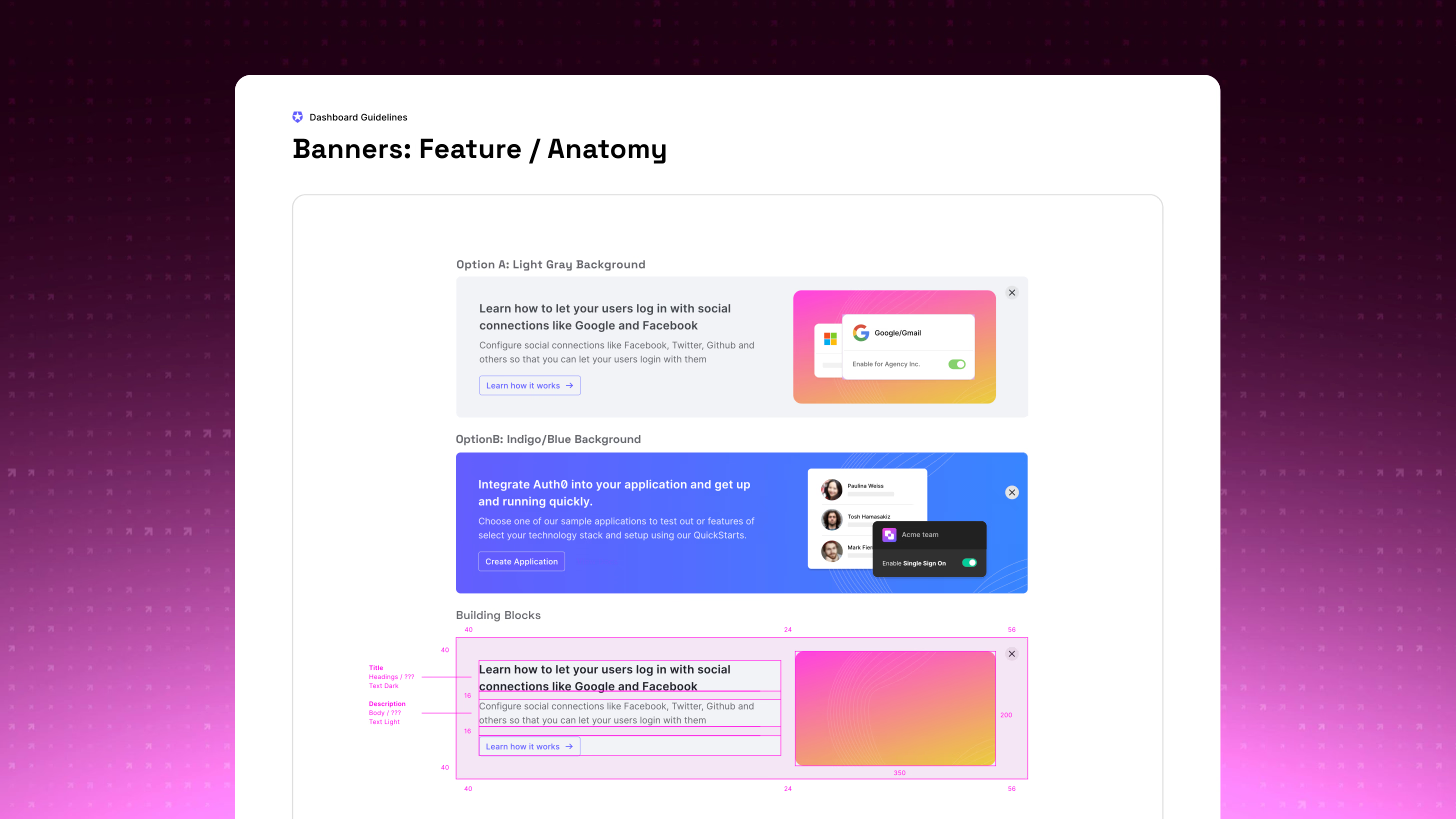
Anatomy of a feature banner showing a light-gray and an indigo-blue variant, plus a building-blocks breakdown labeling the title, description, and call-to-action with spacing and image-grid measurements.
Feature-banner anatomy: title, description, action, imagery, and the spacing rules between them.
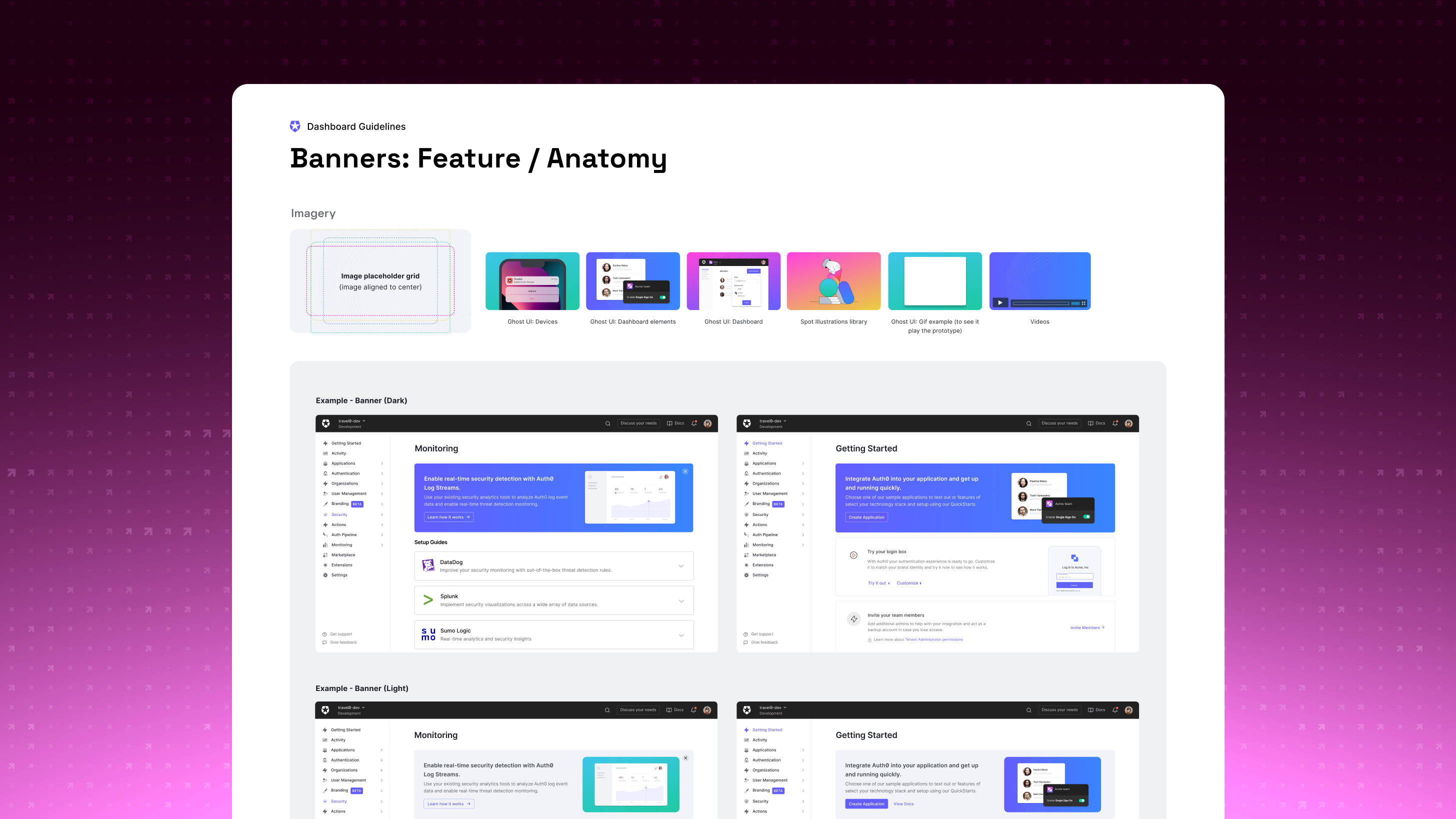
Imagery guidance for feature banners — an image placeholder grid alongside a library of Ghost UI device, dashboard-element, and full-dashboard treatments, spot illustrations, GIFs, and videos — with dark and light banner examples assembled in the dashboard.
The imagery library and dark/light banner treatments that keep tone consistent across surfaces.

The judgment call running through all of it was restraint. Enterprise users are working, not browsing, so the real question was when a surface earns a moment of personality and when it should get out of the way. I designed both ends of each pattern, the expressive and the quiet, along with the rule for choosing between them.
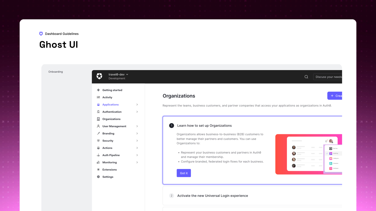
A feature-onboarding callout inside the Organizations page, highlighted with an indigo border and a numbered step, walking the user through setting up Organizations without blocking the surrounding task.
Feature onboarding that introduces something new without blocking the task at hand.

Then I wrote it down. The deliverable that mattered most wasn’t any single screen, it was the guidelines: where, when, and how much brand expression a dashboard surface should carry, documented so design and engineering could apply it without me in the room.
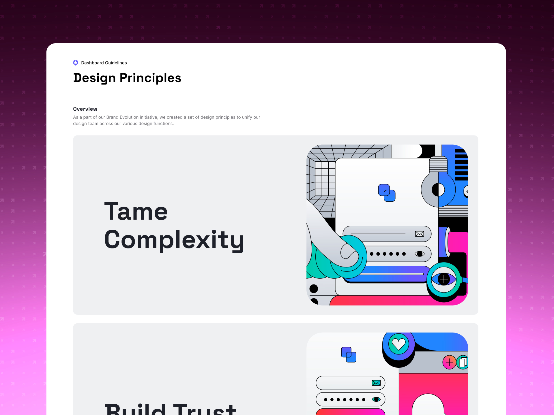
Design Principles page from the dashboard guidelines, presenting illustrated principle cards — Tame Complexity and Build Trust — built from the brand's bold geometric illustration style.
The design principles and illustration system behind the tone.
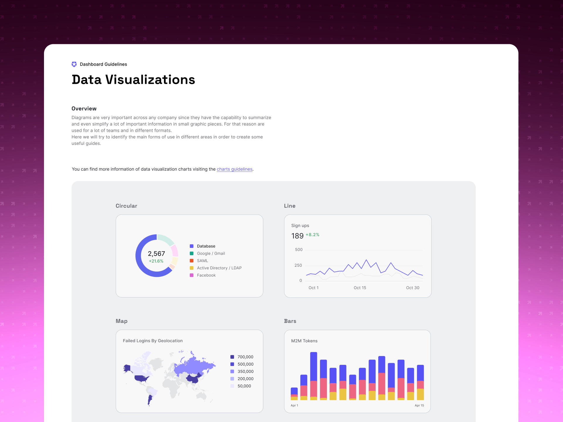
Data Visualizations page from the dashboard guidelines, showing circular, line, map, and bar chart examples with usage metrics, sign-up trends, failed logins by geolocation, and M2M token counts.
Data-visualization guidance design and engineering could apply on their own.

The outcome

  • The guidelines became the standard for new dashboard work, and within a quarter new product experiences were shipping against them by default.
  • Teams could apply the brand themselves, instead of routing every surface back through design.
  • The dashboard finally felt like the brand it sat behind, without trading away the clarity enterprise users depend on.
Next project Attack Protection

Let’s talk.

Tell me about the role and team, whether it’s a product design lead, IC, or something in between, and I’ll get back to you.

I typically respond within 48 hours during business days.